Skip Navigation

Editing a School Homepage

Editing a School Homepage Top to Bottom

  • Introduction & Top of Page
  • Alerts
  • Header Components
  • Top Link Cards
  • Spotlights
  • Card Carousel
  • Announcements

Introduction

Please use the tabs on the left for information and instructions which coincide with the different sections of a School Home Page from top to bottom. If an area does not have any assets in it, it will not display on the published school home page.

Where are the Tabs?

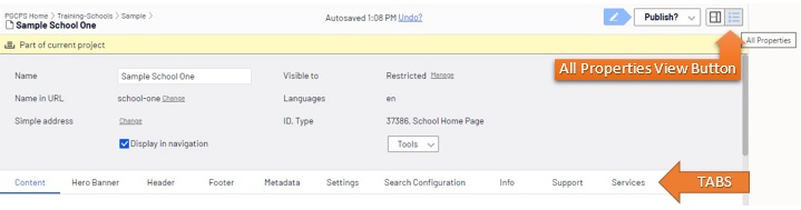
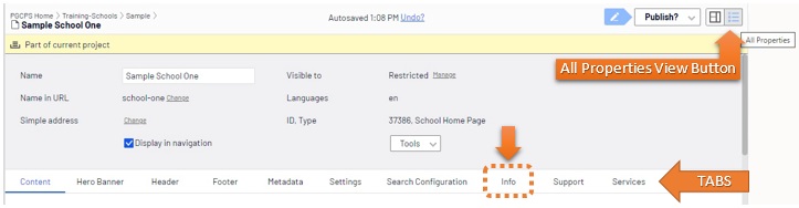
References to "tabs" in instructions refers to the tabs that are visible below the light gray page information box on a School Home Page when you are in the All Properties View. If a tab is selected the title font will be blue and a blue line will appear under the title.  

all-properties-view-school-home-page-tabs.jpg

The Top of all School Pages

The very top of the page is generally maintained by school site settings maintained by Web Services, except for the school's phone number, which can be changed under the Info tab.

Top of Page from Left to Right
  • Link to District Site pgcps.org (maintained by Web Services)
  • School's phone number - Edit on Info tab
    • all-properties-view-school-home-page-Info-tab.jpg
  • Language selection gadget (maintained by Web Services)

School Home Page Site Alerts

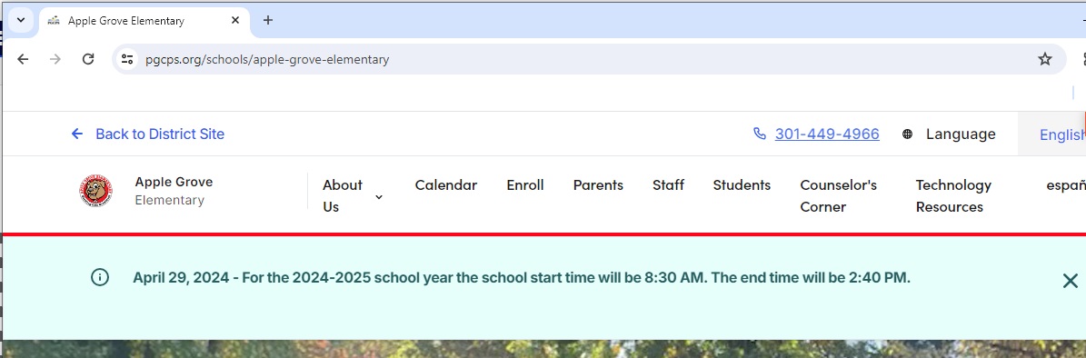
School home page alerts appear at the top of the school home page just below the header area if they are enabled, published and active.

Visual Example of an Information Alert on a School Site

example-school-home-page-alert-information-type.jpg

Types of Alerts

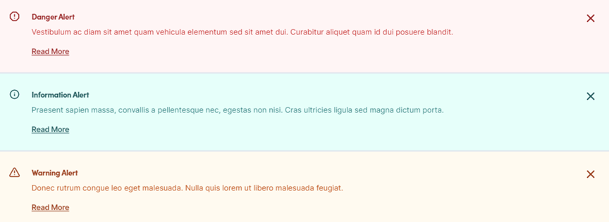
  • Danger Alert - exclamation mark symbol in octagon, red text, and faded red background
  • Information Alert - "i" symbol, green text, and faded green background
  • Warning Alert - exclamation mark in warning triangle, dark orange text and faded orange background

Visual Examples of Alert Types

Alert Types.png

Where Do You Edit School Home Page Alerts?

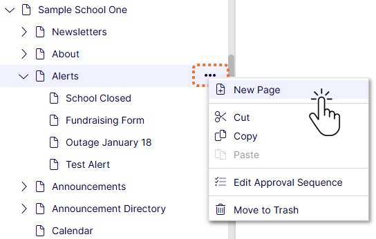
Alerts are created in the Navigation Pane on the left in the Experience Editor.

Accessing Your School in Navigation Pane and Adding an Alert
  1. Click the + to the left of Schools
  2. Click the + to the left of the appropriate school level
  3. Click the + to the left of your school to expand your sub pages.
  4. Hover over the Alerts Index Page and select New Page.

create-new-page-under-Alerts-menu-drop-down.jpg


How to Complete Set Up of a School Home Page Alert

Components of the Header

These items can be edited in the Header tab and Info tab as noted below.

  • logo-header-school-name
    • Header tab
  • School name
    • Info tab - Name line 1
    • Info tab - Name line 2
  • Menu Links
    • Header tab

Editing a School Home Page Header

Description:

This video covers how to edit the items that appear in the header area of a School Home Page including the school header logo, school name and top menu links.


School Header Logo

The school logo that appears in the Header area of a school home page can be changed in two different ways.

  • Replacing media - in order to avoid maintaining old graphics it is best to name your new logo the exact same way as the old one and in the same format, upload it into the Images folder under the Media tab, and publish it. When replacing media (pictures) there can be a delay of a few hours while the Internet cache refreshes.

    Description:
  • Adding new media
    • Crop new logo to the appropriate dimensions for the header logo.
    • Name the image appropriately.
    • Upload the image to the Images folder in the Media tab
    • Publish the image
    • Drag the image to the Logo field in the Header tab of the School Home Page.

      Description:

The top link card area appears just below your banner image or video.

  • Takes up to 3 link cards
  • Display width is not preset
    • Set Width, Default is “automatic” which displays as full width
    • All widths (automatic, ⅓ or ½ width) will appear stacked in a mobile device screen
    • Recommend matching display widths, i.e. display all links cards at automatic width, or all as 1/3 width. This is at your discretion though.

Link Card Types With Examples

Creating Link Card Blocks

Whenever you are creating assets it is highly recommended to follow the naming conventions for those assets.


The Spotlights section of a School Home Page can display up to 3 items. Additional items can be added and schedule to display and archive according to the start and end date as long as only 3 are active at a time.

Adding or Editing Spotlights on a School Home Page

Description:

This video covers how to add or edit a spotlight to the Spotlights section of a School Home Page.

Editing the Card Carousel

Section title default is "Important Information." That can be edited in the Section Title field.

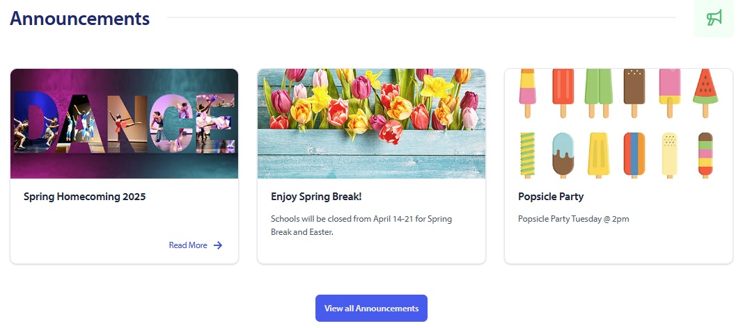
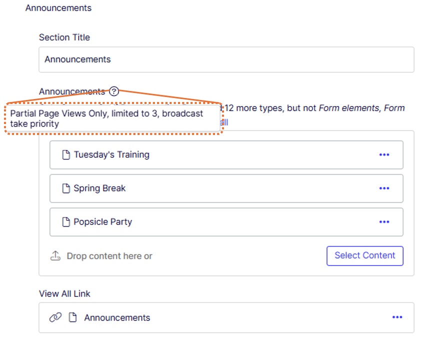
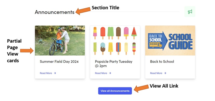
The Announcements section of a school home page can accept up to 3 pages. If pages are added to this section they will appear as 1/3 width Partial Page View cards. You can also link to a web page if you maintain and Announcements or News page.

School Home Page Announcements Section

school-home-page-announcements-3-with-link-published.jpg

School Home Page Announcements Section Fields

school-home-page-announcements-3-with-link-all-properties.jpg

Announcements Section Fields in Published View

school-home-page-announcements-title-cards-view-all-link.jpg